2 April 2016
WINDHOEK
BOTTLE DESIGNS
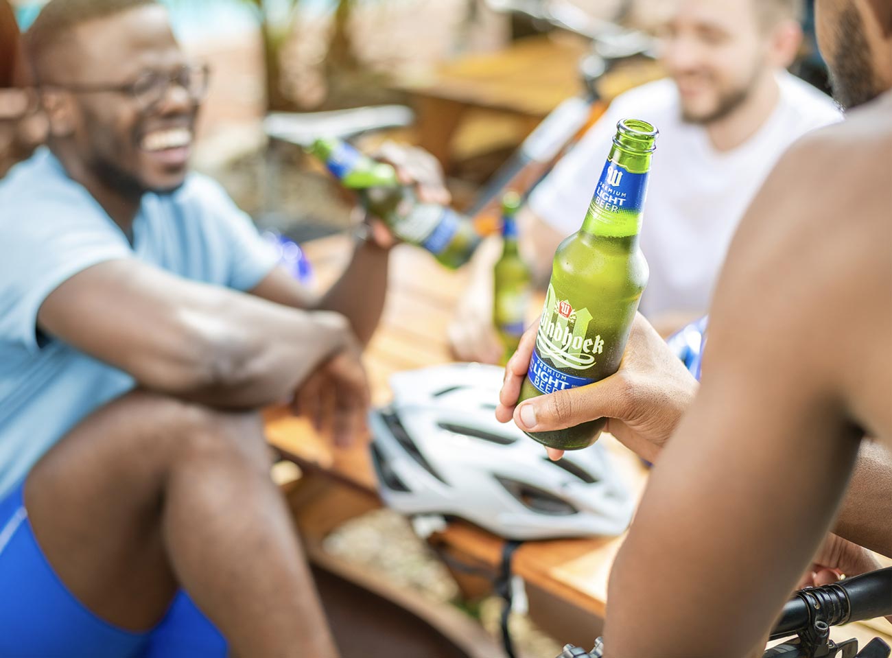
There’s something satisfying about drinking an ice cold Windhoek beer straight out of the bottle. And just like the golden liquid, there’s a lot more to the glistening green bottle than meets the eye. Yes it is sleek, sexy and just about as green as the Springbok rugby jersey, but why?
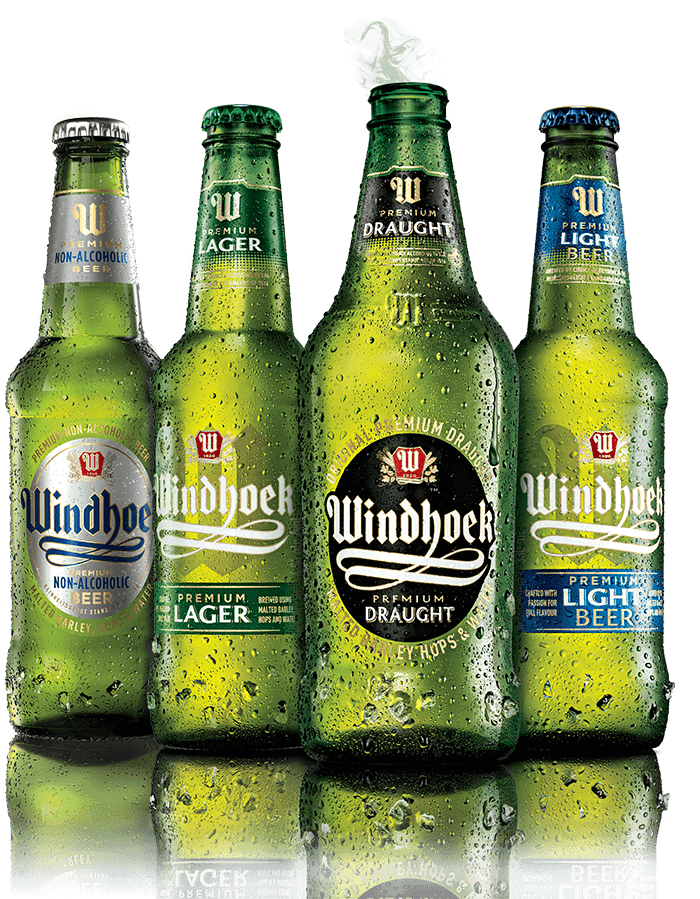
According to Rene Duffy, the Global Marketing Manager, “the previous bottle shape for Windhoek Lager and Windhoek Light had been around for about 10 years. Windhoek was in fact one of the first brands in South Africa that moved away from the short dumpy-shaped bottles to the long-necked bottle that has come to define the premium beer category. I think the rationale behind this shape is that the longer neck speaks more to ‘sophistication’ than masculinity, and has become a passport factor for any beers that want to play in the premium category.
The latest Lager and Light bottles, launched in 2016, retain the long neck but have a broader shoulder and base, with a large de-bossed W in in place of Windhoek. The paper labels have been replaced by premium pressure-sensitive plastic labels that hug the glass and won’t come off in your cooler box”.